
Why Rack Cards Outperform Brochures for Marketing in Southern Minnesota
Aug 13
8 min read
A brochure asks people to stop, unfold, read, refold, and keep track of several panels. Most people will not do all of that while standing in a hotel lobby, visitor center, clinic waiting area, retail shop, county fair building, or restaurant entryway.
Rack cards work because they fit the moment. They are simple, upright, easy to grab, and quick to understand. In places where people make small decisions fast, that matters.
For many Southern Minnesota businesses and organizations, rack cards are the better print piece because they do one job well. They introduce an offer, explain why it matters, and give the next step without asking for too much attention. That makes them useful for tourism, events, local services, restaurants, attractions, health and wellness providers, nonprofits, and seasonal promotions.
Brochures still have a place. But when the goal is visibility, speed, and action, a well-designed rack card often wins.
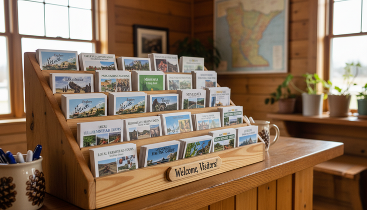
Rack cards fit how people actually browse
The biggest advantage of a rack card is not size. It is behavior.
People scan before they read. They notice a headline, a photo, a color, or a simple promise. If the piece looks relevant, they pick it up. If it looks hard to understand, they leave it behind.
A folded brochure creates friction. The front panel has to do the work of getting attention, but the details are hidden inside. That can be helpful for complex information, but not for quick discovery.
A rack card puts the main message in view right away. The reader sees:
What the offer is
Who it is for
Where it is located
Why it is worth their time
What to do next
That simple flow makes a difference in real settings across Southern Minnesota. Think of someone passing through New Ulm for the weekend, waiting at a clinic in Fairmont, stopping at a winery near Mankato, or looking for things to do near Red Wing. They are not studying a packet of information. They are choosing what deserves a closer look.
A strong card answers that question fast.
Brochures are often more than people need
Brochures can be beautiful and useful, especially when a business needs to explain several services, compare packages, list a full schedule, or walk readers through a detailed process. They work well for sales conversations, direct mail, welcome folders, or take-home information after someone has already shown interest.
But that is the key point: brochures assume more attention.
Many businesses use brochures when they really need a clear one-page message. That can lead to common problems:
Too much copy
Too many photos
Multiple calls to action
Small type
A front panel that does not say enough
Important details buried inside
When a piece tries to cover everything, it can become easier to ignore. Rack cards force better choices. There is less room, so the message has to be sharper.
That limit is useful. It pushes the design toward one offer, one audience, and one next step.
For example, a local attraction does not need to explain every detail of its history on a card placed in a hotel lobby. It needs to show why the stop is worth making today. Hours, location, highlights, and a clear invitation may be enough.
A restaurant does not need a full menu on a lobby card. It may need a strong photo, a short description, distance from the reader, and a reason to visit.
A service provider does not need to list every service line. It may need to promote one seasonal service, a free consultation, or a specific problem it solves.
That focus is where rack cards shine.
The format makes printing and placement easier
Rack cards are usually designed to sit in standard display racks. That makes them practical for visitor centers, hotels, shops, campgrounds, restaurants, trade show tables, community boards, and local partner locations.
Their shape gives them a few practical advantages.
They stand up well
The tall, narrow format works in counter displays and brochure racks. A good headline and image can stay visible even when several pieces compete for attention.
They are easy to replenish
A stack of cards is simple to place, move, and refill. Staff do not have to fold them, assemble them, or explain them.
They feel substantial without being bulky
With the right paper stock and finish, a card can feel polished while still being easy to carry. It slips into a purse, glove box, folder, tote bag, or hotel key sleeve.
They reduce waste from overexplaining
Because the format is focused, businesses can print cards for specific campaigns or seasons without committing to a large multi-panel piece that may become outdated.
In Southern Minnesota, seasonality matters. Summer tourism, fall festivals, holiday shopping, hunting and fishing seasons, county fairs, spring home projects, school events, and community fundraisers all create windows of attention. Rack cards can be planned around those windows.
A good rack card is not a miniature brochure
One common mistake is taking brochure copy and squeezing it onto a smaller card. That almost never works.
A card needs its own structure. It should be designed for fast scanning first and deeper reading second.
The front should do the attracting. The back should do the convincing.
A strong front includes:
A clear headline
One strong image or visual cue
A short supporting line
A location or category if needed
Enough contrast to read at a glance
The back can include:
Three to five key benefits
A short description
A map or simple directions when location matters
Hours, seasonal dates, or service area
Phone number, website, QR code, or other next step
The design should guide the eyes. It should not make every element compete. White space helps. So does hierarchy. A headline should look like a headline. A call to action should be easy to find. Contact information should not feel like an afterthought.
The best cards often use fewer words than expected. That does not make them less useful. It makes every word work harder.
Southern Minnesota businesses need local context
A card that works in a large metro area may not work the same way in Southern Minnesota. The audience, locations, travel patterns, and buying habits can be different.
Here, people often discover businesses through a mix of familiar places and trusted local touchpoints. A card might be picked up at a hotel, a café, a county building, a retail counter, a campground, a community event, a winery, a museum, or a chamber office. That setting shapes the message.
A visitor may need reassurance that a destination is nearby and easy to find. A local resident may need a reminder about a seasonal service. A family may be looking for something to do between events. A homeowner may save a card for future repairs or projects.
Southern Minnesota also has a blend of small cities, agricultural communities, college towns, river towns, tourist stops, and regional service hubs. Design should respect that mix. It should feel clear and professional without becoming generic.
That is where local experience helps. Westbrack Marketing understands that a card for a community festival in southern Minnesota should not read the same as a card for a regional contractor, a boutique, a resort, or a healthcare-related service. The message, paper, finish, quantity, and distribution plan all need to fit the real use.
Design and printing should be planned together
Design and printing are often treated as separate steps. For rack cards, they should work together from the start.
A design that looks good on screen can fail in print if the colors are weak, the type is too small, the margins are tight, or the paper does not match the purpose. A print piece has a physical job to do. It has to be handled, stacked, displayed, and read under different lighting.
Before printing, smart questions include:
Where will the cards be placed?
Will they sit in a standard rack?
Will people take them indoors or outdoors?
Is the piece seasonal or evergreen?
Does it need a writable surface?
Should the finish feel glossy, matte, or more natural?
How long will the information stay accurate?
Those answers affect design choices. A glossy card may help photos pop for food, lodging, attractions, or events. A matte finish may feel better for professional services, nonprofits, or wellness-related information. Heavier stock can make the piece feel more durable. A lighter stock may make sense for short-term promotions.
The same thinking applies to quantity. Printing too few can limit reach. Printing too many can waste money if dates, prices, hours, or offers change. A good print partner helps balance cost, use, and timing.
What should go on the card
The best cards are specific. They do not try to introduce an entire organization all at once. They promote a clear reason to act.
For a Southern Minnesota business, that action might be:
Visit a destination
Book a service
Attend an event
Try a restaurant
Schedule an estimate
Join a program
Support a nonprofit
Claim a seasonal offer
Scan for more details
The front should answer the reader’s first question: “Why should I care?”
The back should answer the second: “What do I do now?”
A useful planning structure looks like this:
Front of the card | Back of the card |
Strong headline | Short description |
Main image | Three to five details |
Simple promise | Contact information |
Place or category | QR code or website |
Visual reason to pick it up | Clear next step |
For example, an orchard card might lead with a seasonal photo and a message about family picking days. The back could list hours, location, what is available, and where to check updates.
A home services card might lead with a common problem, such as storm damage, clogged gutters, or aging windows. The back could list service areas, benefits, and a phone number.
A museum or historic site might lead with a striking artifact or building detail. The back could include admission details, seasonal hours, and nearby attractions.
Each one has a different purpose. The format stays simple, but the message changes.
Distribution matters as much as design
A great card cannot work if it sits in a box. Placement should be part of the plan before the file goes to print.
Good distribution starts with relevance. A card for a family attraction belongs where families already stop. A card for a wedding venue belongs in places where engaged couples and families gather. A card for a seasonal service belongs where homeowners, property managers, or local residents will see it.
Possible placement points include:
Visitor centers
Hotels and motels
Restaurants and cafés
Campgrounds
Retail counters
Community centers
Clinics and waiting areas, when appropriate
Real estate offices
Chambers of commerce
Local events
Partner businesses
It also helps to track where cards move. Ask locations when they need refills. Notice which designs disappear quickly. Use different QR codes or landing pages if the campaign needs more detailed tracking. Even simple feedback can guide the next print run.
Print marketing works best when it is maintained. A card with old dates, faded colors, or outdated contact information sends the wrong message. Schedule refreshes around seasons, events, or service changes.
Why Westbrack Marketing is a strong local resource
Southern Minnesota businesses do not just need a printer. They need help turning a message into a piece people will pick up and act on.
Westbrack Marketing can support the full process: planning the message, designing the card, preparing files correctly, choosing print options, and producing a finished piece that fits the goal. That combination matters because small decisions affect the final result.
A headline that is too clever may not be clear. A photo that looks fine online may not print well. A QR code that is too small may be hard to scan. A beautiful design may fail if it does not fit the rack. A cheap paper choice may weaken the impression.
Local knowledge adds another layer. Southern Minnesota marketing often depends on timing, relationships, and practical placement. A card for a summer event has different needs than one for a year-round service. A tourism piece has different needs than a healthcare, retail, or nonprofit piece. Westbrack Marketing can help shape those choices before money is spent on printing.
That saves time and helps avoid reprints.
The best print piece is the one people use
Brochures are useful when the reader needs detail. Rack cards are better when the goal is quick attention, easy placement, and a clear next step.
For many Southern Minnesota businesses, that makes the choice simple. Use the format that matches the moment. If people are browsing, waiting, traveling, or deciding on the spot, give them something they can understand in seconds and carry with ease.
A well-made card does not need to say everything. It needs to say the right thing clearly.
Westbrack Marketing gives Southern Minnesota businesses a local resource for making that happen, from the first idea to the finished printed piece.


Comments